Design tips for creating amazing wedding invitations- cms
Designing wedding invitations can be scary—which style to choose? Which font to use? Go for pared-back elegance or flashy decadence? Vintage florals or modern minimalism? And above all, how to make it personal and special for the couple in question?
In this article, I’ll give you 10 top tips for designing wedding invitations, using some gorgeous templates as examples. Read on, and get inspired to create your own!
1. Choose a Style
Every invitation design will fall into a style category, or perhaps borrow from a couple of styles. Staying true to a particular style, especially if the couple are having a themed wedding, or love a particular period or genre, can be a great way of giving your invitation project a strong focus.
These are just a few of the design styles that work well for wedding invitations, and the qualities that each style brings to the design…
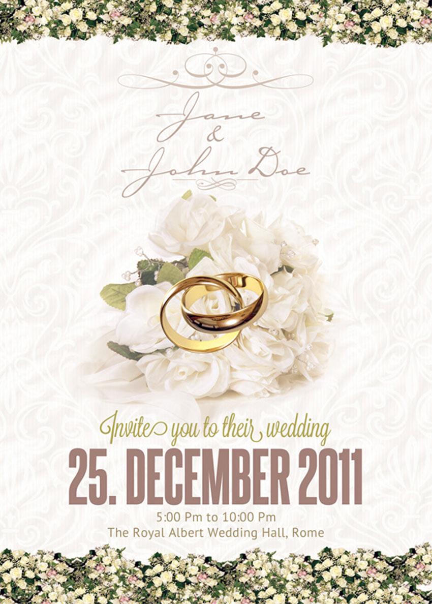
- Traditional and Elegant: This style is classic, timeless and appropriate for both formal and informal weddings. You won’t risk offending any older members of the wedding party with this beautiful, tasteful style choice. Achieve the look of a traditional wedding invitation with script fonts, floral borders and dainty colors.

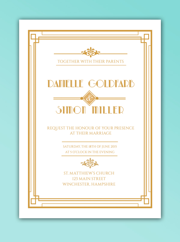
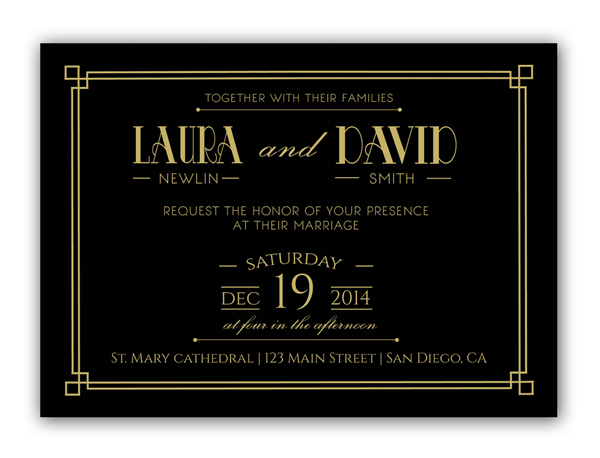
- Art Deco: Another old-school style, but one that gives off a stronger vintage vibe, which can feel hip and on-trend. An Art Deco invitation style brings a lovely, symmetrical quality to your designs, like in the invitation example below, and adds a distinctly glamorous edge with lavish geometric designs and luxe colors, like gold, silver and jet black. You might want to allow for metallic foiling if you go with an Art Deco look.
- Mid-Century Retro: This style borrows from 1950s design, but gives it a hip twist, making it look very relevant and ‘now’. Pastel colors, Americana-inspired typefaces and vintage-inspired graphics, like ribbons and badges, bring a fun, informal twist to this wedding invitation.

Choosing a style is a great place to get started with your designs. Even if you start out traditional, and add a twist of Art Deco with a 1920s-inspired font, mixing some of the main style genres will give your invitations an instantly recognisable and distinctive character.
2. Go for Timeless Typefaces
A font can make or break an invitation design. Step away from novelty, ‘out-there’ type styles, and choose typefaces that have lasting longevity.
Formal classics like Fournier and Caslon will prove to be timeless when the couple pulls out their wedding invitations decades later, and elegant scripts like Allura or Manglayang Script will always look occasion-appropriate.

Unless it’s a themed wedding, this might not be the time to experiment with a novelty font. Stay well away from grunge, marker-pen, and distressed fonts that might look cool, but will make your designs look too informal and flyer-like.
Look for typefaces that have a variety of weights too—you might fall in love with a particular font in a regular weight, but make sure there are italic and bold weights available too. Pulling out names and venues in different weights can divide up bulky text, and make the design appear more balanced. This Vakia font, for instance, is an elegant script with a timeless design.

3. Think About the Practicalities!
Before you dive into designing your invitation, you need to consider a couple of practical issues. Yawn, I know, but nonetheless absolutely essential!
Firstly, what will the dimensions of your invitation be, and will it be oriented portrait or landscape?
Most invitations are designed to fit inside a standard envelope. If you’re sending your design to a professional printer, they may use their own standard-size envelopes for invitations, so your first task should be to get in touch with your printer and seek their advice on sizing. If you’re planning to save money and source the envelopes yourself, you should do this first, and size your invitation to fit your chosen envelope size. This wedding invitation stationery set features several card sizes that are sure to fit standard envelopes.

One more tip—don’t match the size of the invitation to the size of the envelope, as it will be too large to fit inside! Allow a few millimetres extra at least around the edge of the envelope.
Once you are happy with the dimensions of the invitation, you can decide whether to give the design a portrait or landscape orientation. Both can look lovely, but if you’re dealing with a lot of text (e.g. lengthy names or venue address) a portrait design might be more sensible. You won’t risk cramming text as easily as you might on a landscape design (Note: Save the Date and RSVP cards look especially lovely in landscape format).

Secondly, you need to consider how and where your invitation is going to be printed.
Dreaming of a letterpress finish? You’ll need to track down a letterpress specialist who is happy to produce the designs to the time restriction, quantity and price that you’re looking for.
Special printing effects like foiling and gloss printing can also stretch the purse strings, so make sure to not get too carried away (remember, often simple is best!) and shop around for the best deal if you do want something out of the ordinary.
4. News Alert! Florals Can Look Modern
Floral designs have a bad rep, and are often associated with old-fashioned, fusty styles.
I assure you, florals can look modern, and, when done well, strike that perfect (and sometimes elusive) balance of romance and modernity.
This floral wedding invitation unites modern typography with beautiful, watercolor-like flowers. And the blue background becomes a perfect contrast against the remaining subtle colors.
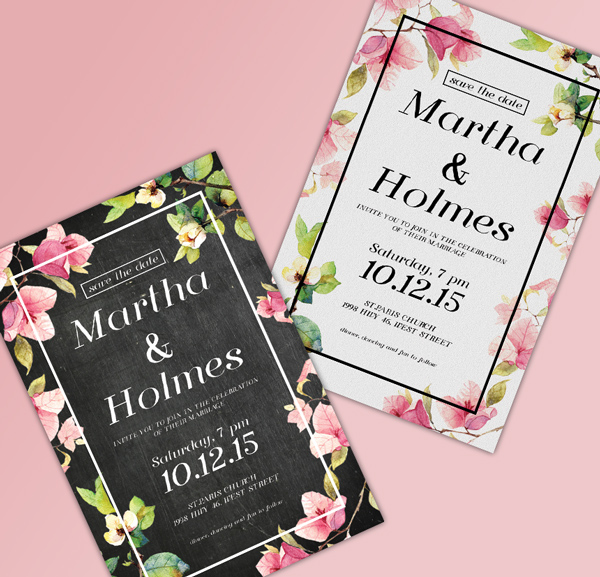
And this stylish wedding invitation is a perfect example of florals executed with a modern twist. The black background provides a stylish contrast to watercolor-style flowers in soft pinks and greens. The feature that makes it modern, not stuffy? Note the minimal white frame around the border of the design.

Even when the color scheme is reversed, the simple frame, now in black, keeps the design grounded and looking ultra-contemporary.

5. Consider Using Photography
Photography is very under-used on wedding invitations. Designs tend to have a typographic or illustrative focus instead.
To give your wedding invitation a unique look, consider introducing photos onto the layout. This can also make your invitations look modern and fresh—ideal if you’d rather not go down the vintage route. You can even incorporate photos of the bride and groom to be, for an alternative photo-based wedding invitation.

To keep your design looking contemporary, set the photo as a background or border, like in this simple wedding invitation design below. This also allows you to make the invite customizable and unique—why not drop in different photos across a batch of invites, so guests receive their own unique invitation design?

6. Align Your Type Centrally
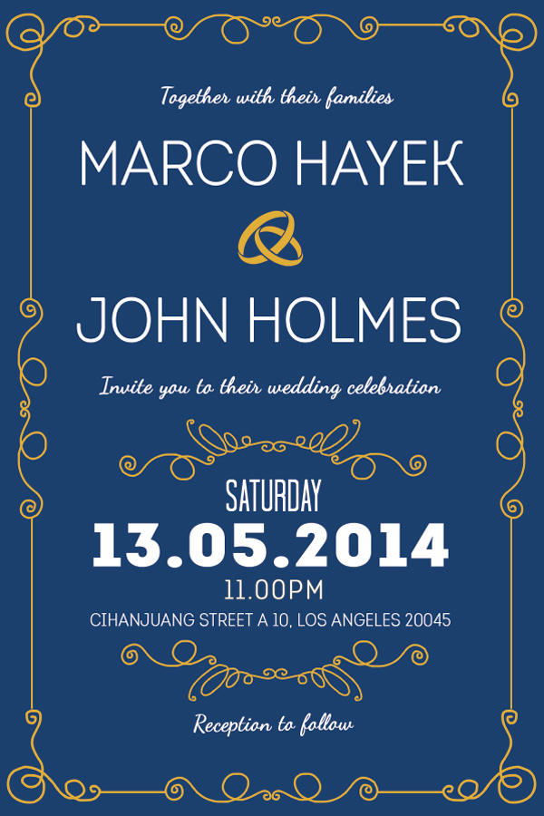
When it comes to typesetting the text for your invitation, it’s best to follow a traditional, tried-and-tested formula. Even if your invites have a modern, unconventional design, you should still align your text centrally, as in this nautical-inspired wedding invitation.

Why? Aligning text centrally makes text appear instantly more formal and important, and distinguishes the invitation as something important and notable. Smaller chunks of text (e.g. names and dates) also look more organized and more elegant when aligned centrally. Flushing the text off-center can make headers look a little messy.
So when you come to arrange the text on your design, make sure to drag a vertical guide out to the dead-center of the page, whichever software you choose to use, and ensure that all text frames are aligned absolutely centrally.
You can also impose a hierarchy on the text by applying a variety of weights and font sizes to different sections. Try setting the names of the couple in a large size italic, the date and time of the event in bold (you don’t want anyone to forget this!) and extra items like dress code in a smaller size and a light or regular weight.
Consider separating different sections of the text using dividers (try ribbon banners for vintage styles, or elegant scripted flourishes for a traditional design, like in the elegant wedding invitation shown below) to make the information more digestible too.
7. It’s ‘&’, Not ‘And’
The humble ampersand, the squiggly ‘&’ used to indicate ‘and’, is your new best friend when it comes to designing wedding invitations.
Particularly when sandwiched between the names of the couple, an ampersand looks elegant, dramatic and interesting, without distracting from the text around it. Replace a useless and sorry-looking ‘and’ with a decorative substitute instead! This Risthi Script provides a gorgeous ampersand perfect for wedding designs like the one below.

A good ampersand takes a bit of hunting. But here are some typefaces with beautiful ampersands to get you started:


8. Use Color to Transform…
You’d be amazed at how simple changes to color on your design can transform the whole look and feel of the invitation. I’m a big believer in the effectiveness of simple, minimal designs, and color is a great way of adding personality and theme to an otherwise classic, functional layout.
Take this winter-worthy example of a wedding invitation. The moody, deep blue background and crisp white text is a world away from the traditional white/cream background with dark text.

The invitation’s dramatic colors are perfectly suited for a winter wedding, but the design could easily be switched up to lighter pastel shades to create an entirely different look.
Don’t underestimate the high-contrast impact of monochrome designs too. A black and white palette can look glamorous, classic and fashionable all at the same time. Drop in a touch of gold or silver foiling for an extra-special color combination.
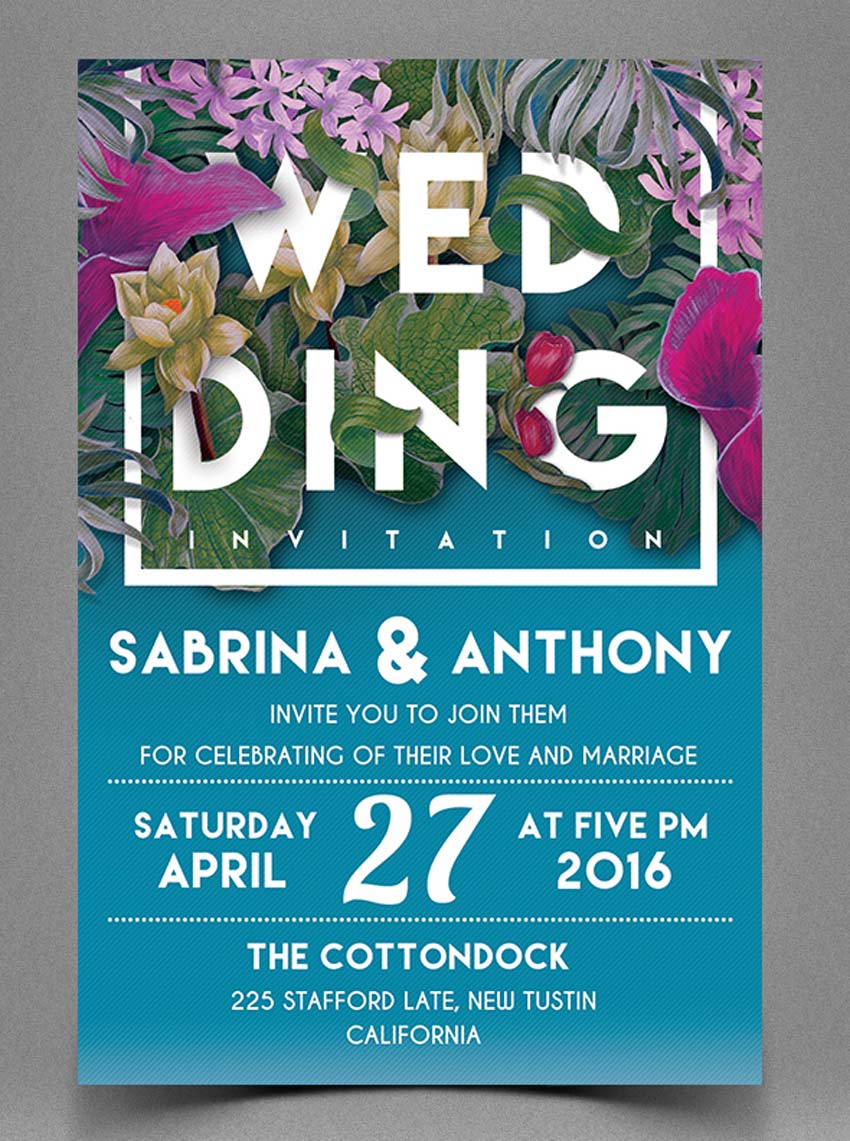
Once you’re happy with the basic layout of your invitation, including text, graphics and borders, experiment with different color combinations, and consider showing these options to the couple to help them feel involved in the process. This colorful wedding invitation shows that this unique style is successful with many different color combinations.

Color is an easy thing to change, but the core elements of the design might be more tricky to rethink; choosing color is an easy gateway into the design process if you’re designing for a client or friend.
9. If in Doubt, Keep It Classic
Classic invitation designs will always be in style, and suit a broad range of events and personal tastes. Unless the wedding has a strong theme, a traditional design will work really well, and, if designed beautifully, be treasured forever by the couple and their guests. This classy wedding invitation features gorgeous script fonts with floral elements that work perfectly for any wedding.
To keep your classic design looking modern, not stuffy, try to balance the design’s feminine and masculine elements. Straight, fuss-free line dividers and a geometric border give this design a masculine edge, while the scripted italics bring a feminine touch.
Why not introduce just one unconventional element to an otherwise classic design? In this example of a classic wedding invite, the typeface has a distinctly vintage vibe, and the dark background keeps it looking glamorous, not staid.
10. Above All… Make It Personal!
Whatever style of invitation you choose for your design, try to keep in mind who the couple are, and what their personal tastes are like.
If you’re designing an invitation for your own wedding, this is unlikely to be a problem. But if you’re designing for a relative, a friend, or a client, try not to get carried away. People commission designers as they want expertise and advice, but wedding invitations are particularly personal, and couples can be deeply disappointed if they wanted a folksy floral design and received a flashy Art Deco creation in its place!
One certain way to avoid this clash of tastes is to have the couple give you a set brief from the very beginning. Ask them what styles they like (e.g. vintage, elegant, contemporary), and show them some examples to fire their interest and give you a better idea of what they’re looking for. A couple that loves vintage-inspired fashion and furniture might also love something like this fun retro wedding invitation design.
You’ll never know a person’s individual preferences unless you ask! It’s also really useful to ask the couple what they definitely don’t like too. There’s no point spending ages perfecting a floral border if flowers just aren’t their thing.
Another important practical issue to consider is the couple’s budget, and take this into account when you put together the design—gold foil can look lovely, but it can also be expensive for bargain-hunting couples. Try a simple pattern design instead, like this retro wedding invitation that features unique pattern elements.

Your Invitation Checklist
To conclude, I’ve covered a number of helpful tips and tricks to get you started with creating your own wedding invitation designs. To get started with designing your own invitations, you can:
- Choose a Style: Pick a well-known design style, such as Art Deco or Traditional, to help steer your ideas and give the design focus
- Go for Timeless Typefaces: Classic fonts that have stood the test of time will always look great on invitations, and will ensure your design never goes out of style.
- Think About the Practicalities: Consider important issues like sizing, orientation and print finish before getting stuck into designing. You won’t regret it later!
- Keep Floral Designs Modern: Floral designs are a romantic, traditional choice for wedding invitations, but they don’t need to look stuffy. Try out abstract illustrations, and contrast against dramatic background color for a design that looks thoroughly contemporary.
- Consider Using Photography: If you’re looking for a unique design that looks fresh and modern, introducing photography into a background or border might be the way to go.
- Align Your Type Centrally: Sure, you can flush your type left or right if you want to, but 99% of the time, aligning your text centrally is going to make your typography look way better.
- Embrace the Ampersand: Replace clumsy ands with decorative ampersands (&) for elegance and added interest.
- Use Color to Transform Your Designs: Avoid reinventing the wheel all the time by switching up the colors of your design instead of changing the main elements of the layout.
- If in Doubt, Keep It Classic: Personal tastes can differ, and design trends may come and go, but classic designs will always have an appeal in wedding invitation design. Add a modern twist to traditional designs to inject a bit of personality.
- Above All… Always Make It Personal: Get to know the couple’s tastes and the vision they have for their wedding day. Can you bring those two factors together into one unified design? Keep the couple involved in the design process without compromising your creative ideas, by allowing them to choose a color scheme for the invitations from a selection you prepare for them.

If you use these ten tips as a starting point for your invitation design, you are well on your way to creating an invitation that’s going to be super-special.
If you’re still feeling a bit lost and in the dark (it happens to us all!), take a look again at some of the great templates featured in the article above, and see if one of those will fit the bill. You can also browse a wider selection of wedding invitation templates to find the perfect style for your event.
Wedding Invitation Tutorials From Envato Tuts+
Need more inspiration? Check out these amazing wedding invitation tutorials below, featuring incredible print designs for elegant, modern weddings. Try them out for fun, or incorporate these designs into your special day!
-
Invitation DesignHow to Create a Rustic Wedding Invitation in Adobe InDesignGrace Fussell
-
WeddingsHow to Create a Watercolor Wedding Invitation in Adobe InDesignGrace Fussell
-
WeddingsHow to Create a Wedding Invitation With Cool Post-Print EffectsGrace Fussell
-
WeddingsHow to Create a Floral Wedding Invitation and Matching EnvelopeGrace Fussell
-
WeddingsHow to Create a Vintage Wedding Invitation in Adobe InDesignGrace Fussell
-
WeddingsHow to Create a Stylish ‘Save the Date’ Card in Adobe InDesignGrace Fussell
-
Print DesignCreate Beautiful Wedding Invitations Using Adobe InDesign and TypekitGrace Fussell
-
DesigningCreate a Spring Wedding Invitation for Die Cutting and Embossing in InDesignGrace Fussell

On – By Grace Fussell